A brand before there is a shelf
menoé is vegan hair care for men. In this market the packaging on the shelf helps decide the purchase — so the brand has to stand before the product does.
Scope of the collaboration
- Brand book
- Logo
- Colour system
- Typography
- Packaging
- Applications
A market where the shelf decides
Personal care is bought in passing. Seconds decide between two bottles, and what works in those seconds is not the formulation but the appearance.
A new brand has no credit of trust to draw on. At first glance it has to look as though it has been around for a while.
A rule set rather than individual drafts
A logo alone does not carry a brand. What carries it is repetition: the same typeface, the same colours, the same spacing — on the bottle, on the packaging, in the feed, on the website.
Hence a brand book rather than a folder of files. It records what applies and makes the brand independent of us: any photographer, printer or agency can work from it without guessing.
What came out of it
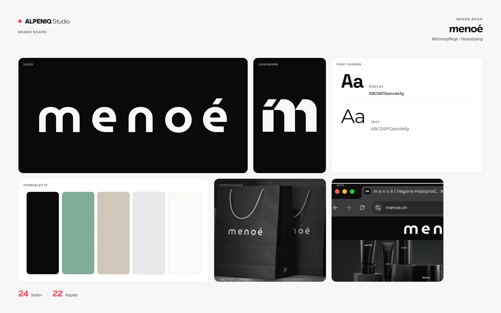
Wordmark and monogram
Two forms for two situations: the full mark and a symbol still legible on a bottle cap.
Colour and type
A fixed colour system and a font pairing for display and body text — including clear space and minimum sizes.
Packaging and applications
The brand in use: on packaging, on application examples and in the digital presence.
Where things stand today
The brand book runs to 24 pages across 22 chapters and sits with menoé.
Our work does not reach further here: website, campaigns and distribution are not with us. The book is deliberately built to work without us.
Does your brand stand before your product does?
We look at what your brand currently fixes — and what gets decided from scratch every time.